FYI – I thought you would like to know that we have a prototype of the redirect and plan to implement it once approvals are in place.
Debbie
From: Kramer, Jack [mailto:[log in to unmask]]
Sent: Wednesday, August 03, 2011 2:53 PM
To: [log in to unmask]
Subject: Re: [MSUNAG] MSU web sites in context
We hope you'd be accessing MSU on a phone through MSU Mobile (m.msu.edu) though obviously there's no redirect set up to force you there. The "normal" site has been designed around normal desktop/laptop tasks.
----
Jack Kramer
Manager of Information Technology
University Relations, Michigan State University
w: 517-884-1231 / c: 248-635-4955
From: Laurence Bates <[log in to unmask]>
Date: Wed, 3 Aug 2011 14:43:44 -0400
To: University Relations <[log in to unmask]>
Subject: RE: [MSUNAG] MSU web sites in context
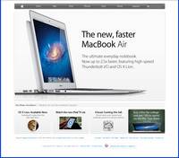
All of that is true Jack and I am certainly no design expert, but in some ways we actually have it easier than Apple. What MSU is selling is principally a student lifestyle and a passport to a decent job in the future, for which white space and hoopla may well be appropriate. The MSU banner isn’t too much of a distraction on a large screen but on my cell phone, that and the URL takes up 60% of my horizontally oriented screen. I don’t know what percentage of future students view MSU web pages on a cell phone but the number may be growing quite rapidly. Fortunately, they will probably have better equipment than my Android 2.2.2 based phone but it is still something to consider – at least until I get my iPhone 5 ;-)
Laurence
From: Kramer, Jack [mailto:[log in to unmask]]
Sent: Wednesday, August 03, 2011 2:10 PM
To: Laurence Bates;[log in to unmask]
Subject: Re: [MSUNAG] MSU web sites in context
Apple's big advantage over us, though, is that they'retrying to sell a product and can specifically emphasize whatever their latest and greatest product is using the large center portion of their site; unfortunately, it's awfully tough to put a college degree in a nice shrinkwrapped area and say "here, buy this". Our site is spread out to provide greater focus on what research said people used our page for most – quick information about the institution and very specific, targeteditems used frequently by students, faculty, and staff. Other approaches drowned site users with too much information or too many options and drove them away, usually to Google which deep-linked them to the areas they wanted to find anyways.
----
Jack Kramer
Manager of Information Technology
University Relations, Michigan State University
w: 517-884-1231 / c: 248-635-4955
From: Laurence Bates <[log in to unmask]>
Date: Wed, 3 Aug 2011 14:02:22 -0400
To: University Relations <[log in to unmask]>
Subject: RE: [MSUNAG] MSU web sites in context
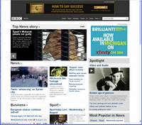
It is interesting to view sites in terms of their attempts at branding. Apple has refined a capacity to say more with less that works very well for them both in their products and their web page. The BBC example on the bottom right is an example of a disturbing trend to sell the upper portion of web pages to advertisers.
Laurence
From: Kramer, Jack [mailto:[log in to unmask]]
Sent: Wednesday, August 03, 2011 12:17 PM
To: Laurence Bates; [log in to unmask]
Subject: Re: [MSUNAG] MSU web sites in context
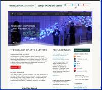
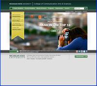
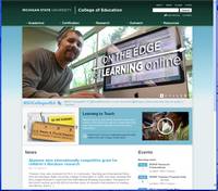
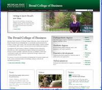
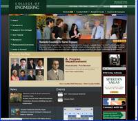
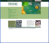
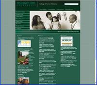
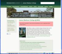
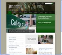
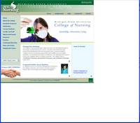
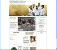
Looking at these sites I'm happy to see that most of them have adopted at least some of the current brand standards – we're presenting a much more cohesive look to the Web than we used to which is great for the institution as a whole. I know that somewhere around here we have a bunch of research that University Relations commissioned in regards to the homepage design and the site standard that's based off ofthat and , if I recall correctly, the research pointed to the green top of page bar as a good way to convey the MSU Green branding while still allowing white space usage on the rest of the page. On the MSU homepage it also draws the eye immediately to the navigation placed at the top which helps site users get to their commonly used resources quickly. Apple's site is a good example of this principle – they don't go quite as bold as we do, but the contrastingcolor versus the rest of the page makes it very simple to pick out the important navigation elements at speed.
----
Jack Kramer
Manager of Information Technology
University Relations, Michigan State University
w: 517-884-1231 / c: 248-635-4955
From: Laurence Bates <[log in to unmask]>
Reply-To: Laurence Bates <[log in to unmask]>
Date: Wed, 3 Aug 2011 10:15:11 -0400
To: "[log in to unmask]" <[log in to unmask]>
Subject: [MSUNAG] MSU web sites in context
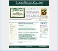
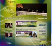
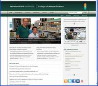
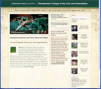
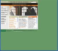
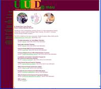
After resetting some Ethernet switches this morning, Ichecked the websites of MSU colleges and was interested to see the different styles used in context with each other and with notable web sites such as Apple, Microsoft, the New York Times and the BBC. They all look great and your mileage may vary of course but the take-away for me was that the siteswith the MSU green header seem to be rather top heavy. Sorry if that was your toe that I just stepped on, especially since I really like the gentle leadership that the MSU web team has provided in recent years, but enough $0.02 can buy a small coffee.
Food for thought…
Laurence Bates
Laurence A. Bates
College of Education
Michigan State University
217E Erickson Hall
East Lansing
MI 48824
517-355-2178
An exuberant rationalist...